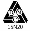
Maker's Mark

While I think your designs look rather interesting, I personally don't like a knife to have a billboard on it. I think once it has to many symbols and a bunch of writing it takes away from the beauty of the knife. I like the KISS principle when it comes to a maker marking his blades.
 
It looks ok it where it is, if you mark the left side of the knife(placing the steel type next to the ricasso).

I don’t agree with the idea of adding an image to the third side. The logo is already a little busy and I think the random images would be confusing to most buyers.

Id like to see it listed above David Mary Custom with just enough separation, like a signature at the bottom of a letter. As in:

Makers Mark
Steel type

Signature
 
......

I don’t agree with the idea of adding an image to the third side. The logo is already a little busy and I think the random images would be confusing to most buyers.....

It’s looks too busy. Also, if you want to put something on the third side, it should be the date of manufacture. Your name/steel type/date would suffice without the logo.

n2s
 
I agree the logos make it all too busy.
Here’s my opinion


If you want to keep it simple and all in one place, put the steel under your name or under the logo and your name on top of the logo...

If you want to make it look awesome... keep the logo and put the steel under it... then etch the David Mary Custom along the spine between the handle scales. I know that’s more work but to me it’s classy...

you could also etch the logo and name on one side and just the steel on the other
 
How about David up the left side, Mary down the right, Custom under, and then the steel type under Custom?
 
Lots of good points, thank you all.

I personally don't like a knife to have a billboard on it.

Excellent point, and I agree. Better not start doing something I dislike on other knives (e.g. the Broken Skull)

Also, if you want to put something on the third side, it should be the date of manufacture.

This is an interesting idea. Of course the actual date would be too difficult, given that I currently don't print my own stencil. Year is more plausible, but I feel like if I were to go in that direction, province or country would be a priority over year. Maybe not. I'm not sure yet, but I don't think I'll go in that direction, because:

If you want to keep it simple and all in one place, put the steel under your name or under the logo and your name on top of the logo...
How about David up the left side, Mary down the right, Custom under, and then the steel type under Custom?

Something like these sounds simplest, and you guys are right, simple in this case is probably better.


If you want to make it look awesome... keep the logo and put the steel under it... then etch the David Mary Custom along the spine between the handle scales. I know that’s more work but to me it’s classy... you could also etch the logo and name on one side and just the steel on the other

I plan to make knives anywhere from 1/4" thick all the way down to 1/16" and the thin knives just wouldn't accommodate etching the spine and being legible to most people. Also more work ends up costing the customer more, which is something I want to avoid wherever possible.
 
What about moving your name to the left side and leave the steel on the right? I has the advantage of shortening the etch slight for shorter flats or whole blades.

Maybe put "custom" on the bottom if it doesn't fit to the left.
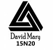
 
What about moving your name to the left side and leave the steel on the right? I has the advantage of shortening the etch slight for shorter flats or whole blades.

Maybe put "custom" on the bottom if it doesn't fit to the left.
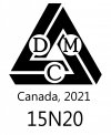
Not quite sure how you mean.

I have been starting to question whether having my name and "DMC" is not a bit redundant. So here are a few things to see how they look. If anything, I am leaning toward the last one, but nothing is decided yet.

Maker's Mark A 15N20.jpg
Maker's Mark B 15N20.jpg
Maker's Mark C 15N20.jpg
 
You could always post a poll and see which gets the most votes. Obviously I would vote for the third option posted above.

Regardless of any results, please remember that they're your knives carrying your name. Stick with whatever option you like best.
 
A poll won't be necessary, nor all that useful I think. Not because the idea itself is flawed (it's certainly not), but the sample size is just too small, plus there's this:

Regardless of any results, please remember that they're your knives carrying your name. Stick with whatever option you like best.

I have already begun setting them up according to the third option in my post above.
 
I LOVE the top one (with or without the DMC letters in the logo...although I like them in it).
I think with the DMC letters in the logo, the shortened David Mary with the steel underneath is simple, elegant and to the point.
 
Back
Top