You are using an out of date browser. It may not display this or other websites correctly.
You should upgrade or use an alternative browser.
You should upgrade or use an alternative browser.
Scratching the Etching Itch
- Thread starter Redmeadow Knives
- Start date
- Joined
- Aug 29, 2010
- Messages
- 13,546
- Joined
- Aug 29, 2010
- Messages
- 13,546
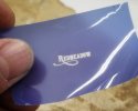
The big one is 0.65 without the tail and 0.75" with the tail. It should look nice on larger blades
The smaller one is about 0.6", it may be a little big for smaller knives, my stamp is 0.45"
Hopefully I can get things to work, no clue what I'm doing here.
The smaller one is about 0.6", it may be a little big for smaller knives, my stamp is 0.45"
Hopefully I can get things to work, no clue what I'm doing here.
- Joined
- Aug 29, 2010
- Messages
- 13,546
- Joined
- Aug 29, 2010
- Messages
- 13,546
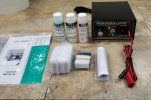
That's funny, I thought the same thing and my next thought was, "Rupe will know". Not sure what I use it for though, maybe it's for glass etching?That yellow plastic spreader is the same type used to spread body filler (bondo) on cars. If you need more, look up "body filler spreader" on Amazon. E-Z MIX is one of the better brands.
I guess it is a devil's tail huh, I thought it was just a swoopy doo lol.I love the devil tail Redmedow that will look sweet!
mitch4ging
Gold Member
- Joined
- Jun 16, 2015
- Messages
- 11,203
- Joined
- Sep 6, 2014
- Messages
- 5,071
Looks like Devil's tail to me, now try it out and post some pics.
- Joined
- Aug 29, 2010
- Messages
- 13,546
The etcher should be here Halloween, I'll be chomping at the bit to try it if the sugar crash doesn't hit me beforehand!
- Joined
- Apr 13, 2004
- Messages
- 16,121
The progression of this should be fun to watch. Many of the wind tunnel model parts we have made are etched in a similar fashion. Next time I'm out at the model vendor in Huntington Beach, I'll have to pick their brains a little.
Funny how everyone seems to like the 2nd font. Me too! I don't know if this is good or bad...
Funny how everyone seems to like the 2nd font. Me too! I don't know if this is good or bad...
- Joined
- Aug 29, 2010
- Messages
- 13,546
- Joined
- Aug 29, 2010
- Messages
- 13,546
- Joined
- Aug 29, 2010
- Messages
- 13,546
Downloaded it and checking it out now.
- Joined
- Aug 29, 2010
- Messages
- 13,546
Inkscape is perfect so far, I can measure everything, space individual letters, curve things and do all kinds of stuff, good call Tim.
T.Knotts
Moderator
- Joined
- May 14, 2010
- Messages
- 450
Inkscape is perfect so far, I can measure everything, space individual letters, curve things and do all kinds of stuff, good call Tim.
Save as an SVG and you can enlarge or shrink and not lose resolution
- Joined
- Aug 29, 2010
- Messages
- 13,546
- Joined
- Aug 29, 2010
- Messages
- 13,546
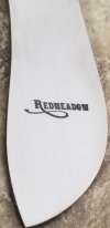
Quick update, I've got a large and a small design that's gonna do the trick.
Had to move to a simpler font. I'll revisit the swoopy swoop when I get some more etchig under my belt, I can't get it crisp enough yet.
The camera skewed these, they look like they're half italics. The top two are the most recent and really crisp to the eye. I gotta quit lookin at them through the Optivisor!
I think these are presentable, let me know what you think.
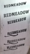
I know this isn't the most excited thread but it's all part of the process. I recorded a video making the stencil and etching, I might add it later.
Had to move to a simpler font. I'll revisit the swoopy swoop when I get some more etchig under my belt, I can't get it crisp enough yet.
The camera skewed these, they look like they're half italics. The top two are the most recent and really crisp to the eye. I gotta quit lookin at them through the Optivisor!
I think these are presentable, let me know what you think.

I know this isn't the most excited thread but it's all part of the process. I recorded a video making the stencil and etching, I might add it later.

