You are using an out of date browser. It may not display this or other websites correctly.
You should upgrade or use an alternative browser.
You should upgrade or use an alternative browser.
Broken Skull blade options?
- Thread starter RAGS
- Start date
- Joined
- Jul 19, 2011
- Messages
- 999
I just can't get past the gargantuan graphics. If they shrunk the font, I think sales would increase. If they sell a lot of them, I'm sure they'll start offering different blade configurations.
Correct me if I'm wrong, but the Broken Skull is the thinnest, lightest 4" bladed folder out there.
Correct me if I'm wrong, but the Broken Skull is the thinnest, lightest 4" bladed folder out there.

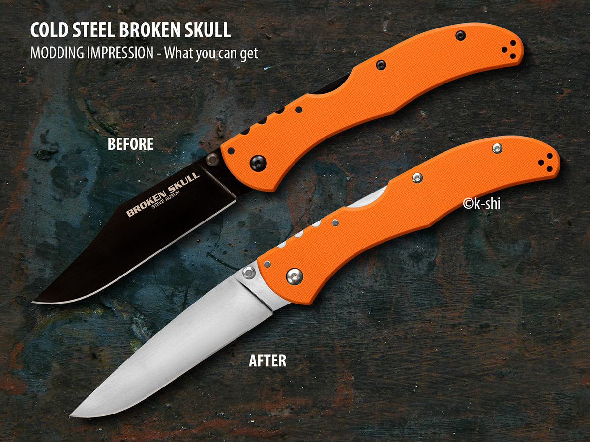
Cool pic k-shi. Thats what I'm talking about! I'm just hoping Cold Steel is already planning something like this. They must realize by now they would sell ALOT more broken skulls if they offered even just an un-coated clip blade without the obnoxious writing. Add to that a spear/drop and tanto option and they would sell even more!! Any Cold Steel reps reading this?
Cold Steel Knives
Moderator
- Joined
- Apr 16, 2013
- Messages
- 1,272
There aren't any plans that I know of to change the Broken Skull line up, but we have a lot of fun things planned for 2017 ")
I just played around a little with Photoshop and checked out what you can do if regrinding the original blade into a drop-point, without loosing blade length.
Just take a look - i really like it!
Looks nice! I'd still prefer a DLC coated blade..
There aren't any plans that I know of to change the Broken Skull line up, but we have a lot of fun things planned for 2017
Nice, can't wait for the announcement! Is there a chance for some teasers? You guys have been teasing the Broken Skull pics on facebook for months before it was released, just sayin......
I just played around a little with Photoshop and checked out what you can do if regrinding the original blade into a drop-point, without loosing blade length.
Just take a look - i really like it!
Looks nice , but...Can't imagine how this drop point would cut better, or be any more useful than the clip,point... shrug
Looks nice , but...Can't imagine how this drop point would cut better, or be any more useful than the clip,point... shrug
Also, this will allow the haters, who are always out there looking for opportunities, to bash CS for copying SOG Flash II's blade shape.
Jokes aside, the blade shape below will actually weaken the blade quite a bit, as the straight "clip" spine of the Broken Skull helps maintain blade thickness towards the middle of the blade, and only start tapering down from the mid point. To have the same strength, the drop point blade shape will have to have the FFG angle changed.
Last edited:
mwhich50
Gold Member
- Joined
- Jan 18, 2011
- Messages
- 3,236
I like the clip point just fine, but I am still holding out for a stonewashed version. Their catalog is HUGE. I can see why they would hesitate to make changes. It's got to be quite a balancing act, trying to decide which models to expand, and which to discontinue.
- Joined
- Jun 30, 2016
- Messages
- 4,673
I just can't get past the gargantuan graphics. If they shrunk the font, I think sales would increase. If they sell a lot of them, I'm sure they'll start offering different blade configurations.
Correct me if I'm wrong, but the Broken Skull is the thinnest, lightest 4" bladed folder out there.
I agree. Has anybody tried to blue the graphic? I haven't had one in hand, but if the logo is uncoated we may be able to tone it way down with some instant gun blue like Super Blue.
I agree. Has anybody tried to blue the graphic? I haven't had one in hand, but if the logo is uncoated we may be able to tone it way down with some instant gun blue like Super Blue.
Hmmmm..... thats an idea. But will bluing take to stainless steel?
- Joined
- Jun 30, 2016
- Messages
- 4,673
Depends on the steel. Never tried to force a patina on XHP.
Depends on the steel. Never tried to force a patina on XHP.
OK,I don't think it will work. I tried some of the liquid cold blue solution (the kind used to touch up gun barrels) on a small section of blade on my Code-4 (XHP steel). Did not leave any stain on the blade whatsoever. But this is the old school stuff,maybe they have something newer that might work better?
Stonewashed would be great.
Yup. You, me and a whole lot of other people agree. If enough people ask for it, with any luck Cold Steel will listen.