- Joined
- Jan 14, 2015
- Messages
- 1,312
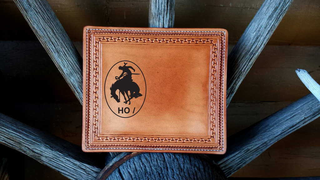
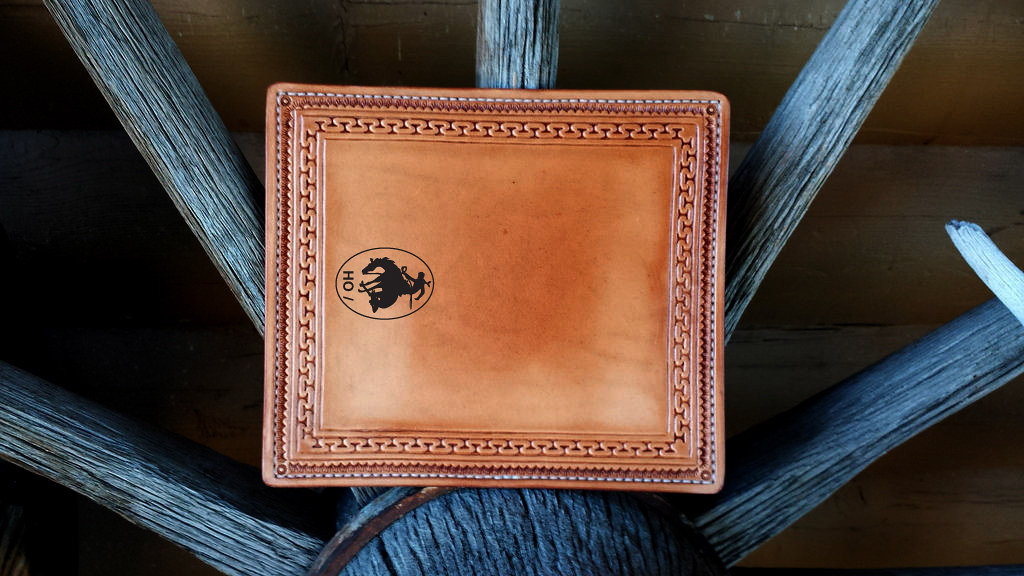
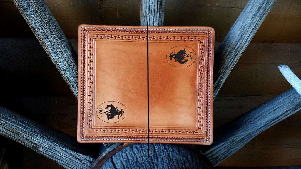
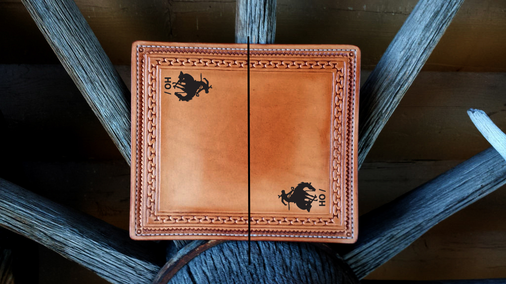
Wow... Great work. As for the bronco, I would only engrave it on the front or back side and turned 90 degrees, same orientation as your makers mark, just on the outside. If you absolutely want to go double engraving I would go with a different personal memento for the other side... Or some text. Maybe offset the bronco to the right side on the front and the name of the ranch to the left of it?
")