Carving Animals is Hard

John Cahoon

JWC Custom Knives
Knifemaker / Craftsman / Service Provider
Joined
Apr 13, 2017
Messages
1,801
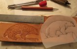
Here are two practice pieces of a Wolverine I'm trying to get right and I'd like to get some advice. I am poor at drawing so this is tough for me. The custom search engine had nada and surprisingly I did not find anything on big google either. Here's the pic.
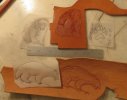
sheath 2 practice.JPG

The bottom one is my first try and I deeply cut and beveled the outline. I came to believe that's not always ideal because the fur cuts don't wash out the outline which I think it should. I've since improved the profile to include two convex downward shapes at the gullet and chestal areas and more angular "knees" on the legs.

On the top one I lightly cut the outlines without bevels, except for the facial area which is deeper and beveled where appropriate. I've since modified the facial area so the snout is narrower, to better represent the weasel like features of the snout, and I think the left side of the hind leg needs help but I don't know what exactly. Pear shading of the chestal area, inside right front and hind leg, and all around the head seemed in order. Then started light cuts working off a photo and the sketch to get the fur cuts the correct direction, doing small areas then moving on and slightly changing direction.

So questions are: How should I fix the hind leg? Am I on the right track overall? Any tips on improving or adding features that I don't know about? Any you tube tutorials I can watch someone doing it right?
 
Please, please, take it for what it's worth. I'm no artist. But to me the top one isn't a wolverine, I see a bear. The bottom one is much, much better. The bottom design is a bit stylistic but I can see a wolverine in there. The main thing that I think would improve both images is some dramatic backgrounding. I've done some images I wasn't happy with but beating the crap out of the background has made the images stand a lot prouder.

For instance.. your top image looks like a bear. A sad bear, but a bear. (I don't mean sad regarding your work, at all, it's beautiful. He just has a morose look to him.) I really think if you just beveled around the design and backgrounded with a camo stamp behind it you would have something special. Back to wolverine land.. you bottom pic is wonderful, it just has to have some contrast to set it off. Take that exact piece of work, bevel around it, background behind the tooling, apply some antique, buff with a T-shirt, and I guarantee you will blow your own mind with what you have.
 
Addendum- One key thing with figure carving is always tool the object that would appear closest to you first. I should have a visual aid for this but basically if something sticks out towards your eye first, you tool it first. I did a carving with a dragon and shield. To me the shield was the thing that would get shoved in your face first, so its outlines, bevels, and tooling were finished first. The dragon was just the dude holding the shield so I did all of his detail work afterwards. When you layer beveling on top of each other it adds a bit of complexity.
 
Thanks Grogimus, I saw and loved that dragon sheath, great work. I saw the bear right off too and modified the snout area narrower on a new sketch. Thanks a ton for the tips, I'll try them out asap.

Cheers
 
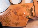
You need to get your hands on a copy of Al Stohlman's Figure Carving Finesse book. It is a bible for learning to properly carve figures. I continue to use it along with the pattern pack it comes with for the figures I occasionally get asked to do. I am not great by any measure but it made me able to do at least adequate work that was clearly what I intended it to be. The Elk in this picture comes directly from that book and, although there is much room for improvement, it is recognizable. This was my first figure.Elk.JPG
 
Nicely done Robert 88, I'll have to check into the book, should be a great resource. Yes Paul I also got my images from google but you found some nice new ones which I'll try out as well, including a face portrait that looks promising. Pencil might be easier to reproduce than photos I think.

Now, regarding the bear... for a little Friday humor I'll put on my Cliff Claven Mr Knowitall hat (the mailman from the old tv show cheers for any youngers out there)... "Well you know Norm, the ancient natives of Minnesota used to call them Waka pa tipita, meaning Little Brother Bear in the tongue of the time, and it was a commonly held belief back then. It wasn't until the late 18th century when Dr Flitzenberger of the University of Stuttgart proved that they were actually related to the weasel, the only species in the genus Gulo of family Mustelidae, hence the name Gulo Gulo, meaning the glutton"

Thanks for the help everyone, I'll keep at it.
 
Wow Robber thanks again... great level of detail in those two.
 
That's the sort of thing that you have to draw a bunch of times to get right.
My trick for that is working on tracing or layout paper.
(Layout is still translucent but a brighter white.)
Instead of drawing the piece over and over from scratch, put the drawing you have under a layer of tracing paper and work on that.
This way you only have to redraw the part you want to change / get right.... lets say the face...
Once you get that bit right you can draw in the rest.
Or you can photocopy the 2 sketches and put the new face on the old body with scissors and glue.
Its a great method for fine tuning your drawings.

Hope this helps.
 
Yes sir, Ebbtide repetition is key for me...do over do over do over... but eventually I'll get there. Slowly, like the tortuga.;)
 
Good morning, here is a revised version of the Gulo Gulo, I modified the legs to be more angular around the knees, more of a shoulder hump and made the gullet and chest more pronounced. I think I can live with this, how about you? Would you put this on a sheath that was going to a customer? I'd take the advice from Grog about a decorated border, with background using my common garden rock style.

3rd profile practice.JPG

If you notice the sketch is on 4 mil matt mylar, a material I have a ton of at work for plotting maps. We buy in rolls 36" x 200'. It is very sturdy, erases well and you can really bear down with the modeling tool, and use it repeatedly without damage. Since it retains the indentation after first use the next ones trace easily. If anyone's not using this I'd be happy to send a half dozen 8x10 sheets to say the first 10 people who PM me. I've gotten so much out of this forum and maybe I can give something back.
 
Last edited:
Looks good as is, but............If you lighten up a little on the depth of the "hair" swivel cuts and add in about 5 times more of them following the flow it would look more natural, and the curves of the flow can actually enhance the definition of of the areas where you have used a spoon or pear shader.
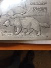
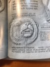
Refer to the hair cuts on the Al Stohlman examples pictured above in post #8 of this thread.

Paul
 
thank you Paul, excellent advice as always. It does kinda look like a porcupine with those deep cuts:>) now that I see that!
 
If you plan to do more figure carving, I recommend getting a couple of hair blades for your swivel knife. They come in different pitches for coarse or fine hair and save a lot of work. They do not actually cut but make shallow parallel groves. Being on a swivel knife, it is simple to follow the flow of the animal with the hair. It does also take real swivel knife cuts in strategic locations to highlight body edges or the ruff of some animals but the hair blades really make the process much easier to control.
Randy
 
Hi Robber, just yesterday I finally saw the text in your Stohlman photo referencing hair blades, very interesting I'll see if I can pick one up. Thanks
 
I'm no carver but I've a bit of drawing experience.

I'll start off by saying for someone who's "poor at drawing" you sure can draw a decent and recognizable wolverine :D

The first drawing, the side profile, has great proportions. It's the same size and general shape as a wolverine which makes it recognizable. I'd go as far as saying I think it's the best one, all you'd have to do is adjust the eye and you'd have a perfect cartoonish style wolverine. It'd work great for a logo.

The biggest improvement I think could be made is the definition of the underlying anatomy - you've already noticed the leg, but don't forget the shoulders, back, hips. Those black and white images are great reference, they show you the curves of the back, neutral position of the legs, and even parts where the fur hangs down (the parts you'll want to make "furrier").
You're doing great, keep looking for reference images of real wolverines, different poses are preferable so you can really learn the proportions. Even a skeleton would be very helpful, it'll fix the limbs in their proper places so you could just draw the fur and shapes over it.
 
My favorite thing about doing leather carving is that I can make up for my lacking skill in drawing with detail on the leather.

I've always wanted to be able to draw something well but after 30 years of muddling around the best I can do freehand is a decent Darth Vader helmet. Poorly. Very poorly.

This drawing is hanging in my living room. It's not good but I really don't think I'll ever get any better. My girlfriend at the time coached me through the whole thing and she's an art major, this is the best I've ever done.
0Iu1u7Hl.jpg


It doesn't suck but it isn't something I would dream of offering to someone else, much less ask for money for.

On the other hand, I'm pretty proud of my leather carvings. Getting the basic shape down is fairly simple, but it's the details that make them pop.

pdYbL8Il.jpg


jWMEeRMl.jpg

ZJP2K5Yl.jpg

9p3DyQSl.jpg

iqPI3gDl.jpg

fqGCcywl.jpg

lNUOX3Gl.jpg


RbZh87nl.jpg


That crow was done years ago, still way better than my pencil drawing. The point I'm attempting to make is that you don't have to be a great artist to make some pretty nice looking leather designs. If you want to make some nice looking leather designs the sky is the limit. I find it to be much more about obsessive attention to detail than artistic spirit.
 
Thanks for the info Lieferung and Grogimus. Grog mentioned above a border would really set it off, but you see I don't have room near the seam to go all the way round, and on the other side it would wrap around the fold a bit. Maybe next time the figure can be shrunk a little.

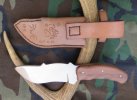
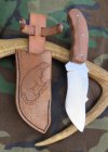
OK, here goes, this one I'm overall satisfied with. The body shape has been modified around the gullet and chest, he has a hump behind the head and the legs are more angular. On the deeper cuts around the collar, chest and a little on the legs I used an old swivel knife and the finer fur is cut with an exacto knife. Background is basically tapped in with the dull point of a common garden rock. The sheath is lined with a dark, fine felt like fabric and the edges are pretty darn smooth.

IMG_1199.JPG IMG_1200.JPG
The knife has a ways to go yet. Gulo Gulo is the catchy scientific name (glutton) for wolverine and I thought it added some mystique to the package. Any advice on areas I could improve would be greatly appreciated.
 
Last edited:
Back
Top