- Joined
- Jun 9, 2011
- Messages
- 29,882
it was retro in 1990, still retro in 2000, still retro in 2010, and now still retro in 2018.........It’s retro ok?
20 more years it will still be retro.........
The BladeForums.com 2024 Traditional Knife is ready to order! See this thread for details:
https://www.bladeforums.com/threads/bladeforums-2024-traditional-knife.2003187/
Price is $300 ea (shipped within CONUS). If you live outside the US, I will contact you after your order for extra shipping charges.
Order here: https://www.bladeforums.com/help/2024-traditional/ - Order as many as you like, we have plenty.
it was retro in 1990, still retro in 2000, still retro in 2010, and now still retro in 2018.........It’s retro ok?
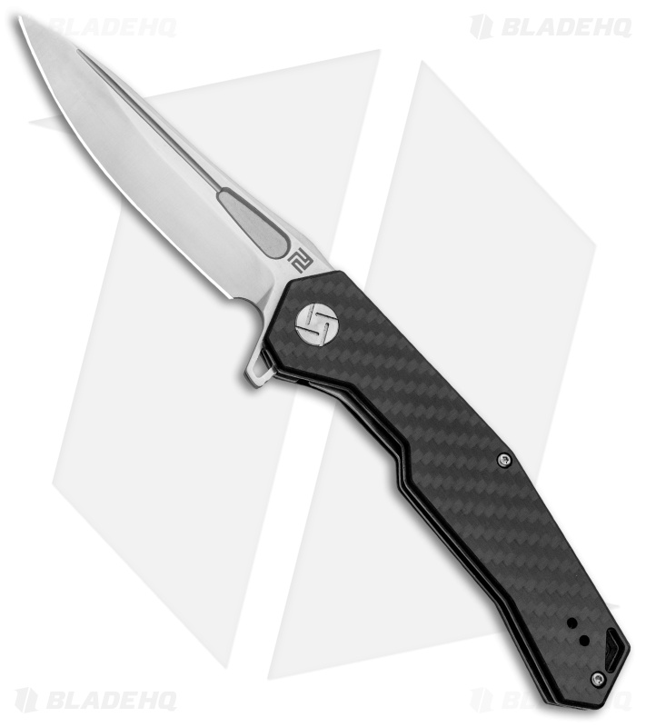
I'll start with: Artisan Cutlery's "is that a swastika?"
I don't know if that's a modified swastika but it sure looks to me that at least some of Walter Brend's knives have a Confederate flag on them.


Dear God, yes.Don’t forget about Sog. We know it’s a Sog, you don’t have to write it on the blade AND the handles.
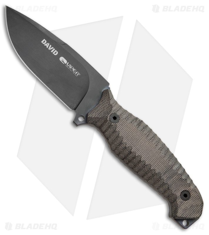
"Raging Jap " !
Your analogy doesnt really hold.If you start removing lines and moving them, then sure, you could could make the case that it’s a swastika. However, removing some existing parts of a logo, and moving other parts of a logo changes the logo itself. So it’s not the original.
By using your logic, the BMW logo looks like a swastika. Just remove the blue and white color, make the perimieter a square rather than a circle, and remove some of the lines. And you now have a swastika.
You’re looking for something that’s not there.

cold steels font used....... the 1980s names and font wont go away.......
It’s retro ok?
Don’t forget about Sog. We know it’s a Sog, you don’t have to write it on the blade AND the handles.

Dont you want a sog pocket clip to go with your sog handle and sog blade?

If you are talking about their old "knife in stone" logo, I'd have to agree.kizer is kinda weird, their logo looks like a shrub. And what’s with the Benchmade butterfly and Spyderco’s little tic lol at least sog, crkt, ZT, cold steel etc just spell it out. Imo gerber has one of the coolest looking logos
kizer is kinda weird, their logo looks like a shrub. And what’s with the Benchmade butterfly and Spyderco’s little tic lol at least sog, crkt, ZT, cold steel etc just spell it out. Imo gerber has one of the coolest looking logos
That's one logo that doesn't need changing!Benchmade used to make alot of butterfly knives, hence the butterfly logo.

That's one logo that doesn't need changing!
If you are talking about their old "knife in stone" logo, I'd have to agree.
