The magical sword Excalibur that only Arthur could put from the stone . If only Gerber could live up to the logo .Not sure if it’s old or new but it looks like a sword going through what looks like either a rock or a capital G
I chose BMW on purpose. I'm surprised no one picked up on it until now.I agree that the pivot in the OP looks akin to a swastika. Some cultures dont have the same problem as the West with the symbol (which was tainted by the Third Reich). Quite the contrary.
Your analogy doesnt really hold.
Further more you ironically and unknowingly picked the stylized Bayrische Motoren Werke logo for your comparison.
BMW was closely connected to the Swastika in the sense that the company made airplane engines. A business venture which abruptly halted in 1945.
The stylized logo represents an airplane prop.
I'll start with: Artisan Cutlery's "is that a swastika?"
The Waistline is based off of the canton tower in china, I don't think they're necessarily trying to rip off CRKT. Not in this case, at least. Not sure about their other designs since I haven't tried to find similarities in other knives.No, they couldn’t be designing based on the swastika theme! I just don’t see it.
In all seriousness though I understand the swastikas significance in a wider market and I’m not one of those jews that gets upset by its non Nazi use. (In otherwords the symbol has no magical power over me) That still doesn’t mean I would carry a knife with one, lets say it is not my favourite symbol. Sorry China and India and others who use the symbol, Nazis kind of ruined that one for you.
So if the German police pull you over with an Artisan Cutlery do you not only get charged for the illegal knife but also the charge for having the swastika, which is outlawed in Germany?
It’s not a huge deal to me anyway. The company has designs that are bordering on stolen anyway.
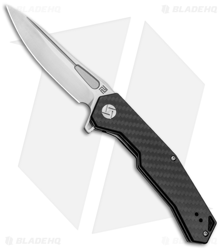
Artisan Cutlery Waistline
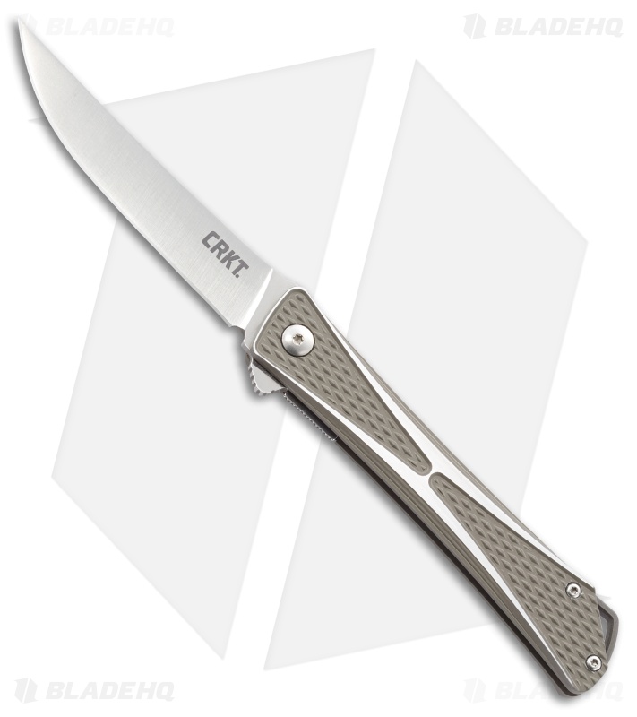
Crkt crossbones
The Waistline is based off of the canton tower in china, I don't think they're necessarily trying to rip off CRKT. Not in this case, at least. Not sure about their other designs since I haven't tried to find similarities in other knives.
Also yes I realize now how much of a fanboy I look like coming into the conversation with their knives in my profile pic
Maybe, but so what?! swastika is not a bad symbol in itself, and before you loose your shit, there are many stylized swastika-like logos out there Chase or GE for example
It is a stylized swastika. If you remove the line that connects the rightmost vertical arm and the topmost horizontal line and move it to the middle of the shape, voilà swastika.
LOLOLOLOLOLOLOLOL
I don't see it so much in the logo as the pivot. The logo looks more like a connected Pd or nY, depending on what angle you look at it.I don’t know man. Alot of people are seeing it. It is also reflected in the pivot.
Can you see a stylized A in this image?
It doesn’t take that much to see it.
Agreed, the ZT logo definitely needs an overhaul.Great discussion. Logos in general interest me so this is right up my alley.
The one that bothers me the most is the ZT logo. Because.. ZT is making some great knives at a good price point, but that logo just devalues the whole thing and make them look cheap and bland. They would benefit greatly by having a more refined and sleek logo to go with their great knives.
Skulls were mentioned.. I personally love skulls, but rarely in a logo/branding context. You can’t just smack a random skull next to your gothic font brand name and expect to ooze badassness. More like reeking lack of creativity..
As for quality logos.. I personally really like the Benchmade Butterfly. Shirogorov is another good one. The Gareth Bull logo is pretty sleek. It works. Also the Hinderer horse is a very strong logo. I don’t personally care for it from a graphical standpoint.. a little too busy, but still.. it’s pretty strong.
I personally prefer as little branding as possible on the knife itself. Especially on the blade. Keep that steel clean!
I don’t know man. Alot of people are seeing it. It is also reflected in the pivot.
Can you see a stylized A in this image?
It doesn’t take that much to see it.
Yeah, I can see the stylized A. The thing is that if their symbology is that sinister as to cryptically (with the rearranging of lines being an intentional camouflage and a known inside secret to some) represent something awful like that, it seems to me more like they would need to be not supported more than they would need a new logo...just sayin'
Yup. That one's the absolute worst (IMO)."Raging Jap " !
I just googled "Artisan Cutlery logo", which took me here, because I was just about to hit "add to cart" on one of their knives when I glanced at the pivot bolt and saw a swastika. You're right, when I looked closer it's just four lines, but they're four very suggestive lines. I'm sure it's unintentional, but it's definitely got that gestalt.It doesn’t look like a swastika at all. It’s 4 lines.