-
The BladeForums.com 2024 Traditional Knife is ready to order! See this thread for details: https://www.bladeforums.com/threads/bladeforums-2024-traditional-knife.2003187/
Price is$300$250 ea (shipped within CONUS). If you live outside the US, I will contact you after your order for extra shipping charges.
Order here: https://www.bladeforums.com/help/2024-traditional/ - Order as many as you like, we have plenty.
You are using an out of date browser. It may not display this or other websites correctly.
You should upgrade or use an alternative browser.
You should upgrade or use an alternative browser.
New 14 run
- Thread starter olywa
- Start date
- Joined
- Dec 29, 2015
- Messages
- 1,233
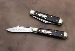
Regarding this current run of 14's, I think the blade - and the knife's overall size when open - is quite usable for a lot of the tasks I use a knife for. It's small size when folded makes the knife very pocketable. But I wouldn't mind a somewhat lighter pull on the 3 examples I have. 
- Joined
- May 19, 2001
- Messages
- 5,253
Regarding this current run of 14's, I think the blade - and the knife's overall size when open - is quite usable for a lot of the tasks I use a knife for. It's small size when folded makes the knife very pocketable. But I wouldn't mind a somewhat lighter pull on the 3 examples I have.
Right on the cusp of comfort for me. If the pen blades are hard to open I'm going to be disappointed.
blanco112
Gold Member
- Joined
- Nov 1, 2016
- Messages
- 1,209
I don't mind the size but would never carry the 14 as my sole knife. But I often carry larger folders so having the 14 as backup in the coin pocket for small tasks is ideal. The strong spring is nice and not too strong for me. Not pinchable (although the Harrison Bays are close) but not a nail breaker either.
Kiro
Gold Member
- Joined
- Mar 17, 2017
- Messages
- 717
Same, I can pinch my GSJ 14, but it's not the easiest. I think most of the time I'll use the pull. Maybe it will get better with a patina. However, I do like how snappy it is. Still way easier to open than the only other small GEC-made knife I have, the NW Little bay.
JTB_5
Gold Member
- Joined
- Oct 6, 2017
- Messages
- 7,828
I think these look great. Makes me wish that I was around when GEC was pumping out clip bladed 15's like they are with the 14's.

Yep.
r8shell
Knifemaker / Craftsman / Service Provider
- Joined
- Jan 16, 2010
- Messages
- 25,440
I decided I'm only going to buy one of these #14s, and that's the one I have my heart set on.Oh boy Oh boy oh boy!!

Fodderwing
Gold Member
- Joined
- Jan 31, 2017
- Messages
- 9,182
Everything I had hoped it would be.Oh boy Oh boy oh boy!!
thepapercut
Gold Member
- Joined
- Aug 26, 2017
- Messages
- 519
The AAPK 14 is up on their site.
Ooooh
Last edited:
- Joined
- May 25, 2018
- Messages
- 616
I normally carry a peanut. Just got my hands on a single bladed 14 and it is a fantastic knife.
I’ll be on the lookout for more. Probably putting my #25s up for sale as they feel too chunky and heavy to me compared to the 14.
I’ll be on the lookout for more. Probably putting my #25s up for sale as they feel too chunky and heavy to me compared to the 14.
Travman
Gold Member
- Joined
- Jan 26, 2016
- Messages
- 8,159
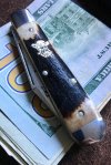
I’d want one of these if it wasn’t an AARP knife. Their shield, blade etch, and tang stamp are just too much. Where is the subtlety? Get rid of the blade etch and tang stamp with the font that is too large. Then get rid of the letters on the shield and reduce the size of the shield by 50%. Then this one would be perfect.

Last edited:
- Joined
- May 14, 2018
- Messages
- 28,969
Agreed, except the tang stamp. That stamp doesn't bother me.I’d want one of these if it wasn’t an AARP knife. Their shield, blade etch, and tang stamp are just too much. Where is the subtlety. Get rid of the blade etch and tang stamp with the font that is too large. Then get rid of the letters on the shield and reduce the size of the shield by 50%. Then this one would be perfect.View attachment 1002684
But you're correct, it's way too much branding for such a small knife

